visualizing geospatial data in R
DataCamp - Charlotte Wickham
11/21/2020
What is spatial data?
- data associated with locations
- location described by coordinates + a coordinate reference system (CRS)
- common CRS: longitude, latitude describes locations on the surface of the Earth

Point data: locations are points, described by a single pair of coordinates


Grabbing a background map
There are two steps to adding a map to a ggplot2 plot with ggmap:
- Download a map using
get_map() - Display the map using
ggmap()
As an example, let’s grab a map for New York City:
library(ggmap)
nyc <- c(lon = -74.0059, lat = 40.7128)
nyc_map <- get_map(location = nyc, zoom = 10)get_map() has a number of arguments that control what kind of map to get, but for now you’ll mostly stick with the defaults. The most important argument is the first, location, where you can provide a longitude and latitude pair of coordinates where you want the map centered. (We found these for NYC from a quick google search of “coordinates nyc”.) The next argument, zoom, takes an integer between 3 and 21 and controls how far the mapped is zoomed in. In this exercise, you’ll set a third argument, scale, equal to 1. This controls the resolution of the downloaded maps and you’ll set it lower (the default is 2) to reduce how long it takes for the downloads.
Displaying the map is then as simple as calling ggmap() with your downloaded map as the only argument: ggmap(nyc_map)
Your turn! We are going to be looking at house sales in Corvallis, but you probably have no idea where that is! Let’s find out.
library(pacman)
p_load(ggmap)
corvallis <- c(lon = -123.2620, lat = 44.5646)
# Get map at zoom level 5: map_5
map_5 <- ggmap::get_map(location = corvallis, zoom = 5, scale = 1)
# Plot map at zoom level 5
ggmap(map_5)
# Get map at zoom level 13: corvallis_map
corvallis_map <- get_map(corvallis, zoom = 13, scale = 1)
# Plot map at zoom level 13
ggmap(corvallis_map)
Putting it all together You now have a nice map of Corvallis, but how do you put the locations of the house sales on top?
Similar to ggplot(), you can add layers of data to a ggmap() call (e.g. + geom_point()). It’s important to note, however, that ggmap() sets the map as the default dataset and also sets the default aesthetic mappings.
This means that if you want to add a layer from something other than the map (e.g. sales), you need to explicitly specify both the mapping and data arguments to the geom.
What does this look like? You’ve seen how you might make a basic plot of the sales:
ggplot(sales, aes(lon, lat)) +
geom_point()An equivalent way to specify the same plot is:
ggplot() +
geom_point(aes(lon, lat), data = sales)Here, we’ve specified the data and mapping in the call to geom_point() rather than ggplot(). The benefit of specifying the plot this way is you can swap out ggplot() for a call to ggmap() and get a map in the background of the plot.
sales <- readRDS(file = "_data/01_corv_sales.rds")
# Look at head() of sales
head(sales)## # A tibble: 6 x 20
## lon lat price finished_square~ year_built date address city state
## <dbl> <dbl> <dbl> <int> <int> <date> <chr> <chr> <chr>
## 1 -123. 44.6 267500 1520 1967 2015-12-31 1112 N~ CORV~ OR
## 2 -123. 44.6 255000 1665 1990 2015-12-31 1221 N~ CORV~ OR
## 3 -123. 44.6 295000 1440 1948 2015-12-31 440 NW~ CORV~ OR
## 4 -123. 44.6 5000 784 1978 2015-12-31 2655 N~ CORV~ OR
## 5 -123. 44.5 13950 1344 1979 2015-12-31 300 SE~ CORV~ OR
## 6 -123. 44.6 233000 1567 2002 2015-12-30 3006 N~ CORV~ OR
## # ... with 11 more variables: zip <chr>, acres <dbl>, num_dwellings <int>,
## # class <chr>, condition <chr>, total_squarefeet <int>, bedrooms <int>,
## # full_baths <int>, half_baths <int>, month <dbl>, address_city <chr># Swap out call to ggplot() with call to ggmap()
ggmap(corvallis_map) +
geom_point(aes(lon, lat), data = sales)
You just made your first data map!
Insight through aesthetics
Adding a map to your plot of sales explains some of the structure in the data: there are no house sales East of the Willamette River or on the Oregon State University campus. This structure is really just a consequence of where houses are in Corvallis; you can’t have a house sale where there are no houses!
The value of displaying data spatially really comes when you add other variables to the display through the properties of your geometric objects, like color or size. You already know how to do this with ggplot2 plots: add additional mappings to the aesthetics of the geom.
Let’s see what else you can learn about these houses in Corvallis.
NOTE: Many exercises in this course will require you to create more than one plot. You can toggle between plots with the arrows at the bottom of the ‘Plots’ window and zoom in on a plot by clicking the arrows on the tab at the top of the ‘Plots’ window.
# Map color to year_built
ggmap(corvallis_map) +
geom_point(aes(lon, lat, color = year_built), data = sales)
# Map size to bedrooms
ggmap(corvallis_map) +
geom_point(aes(lon, lat, size = bedrooms), data = sales)
# Map color to price / finished_squarefeet
ggmap(corvallis_map) +
geom_point(aes(lon, lat, color = price/finished_squarefeet), data = sales)
The last plot wasn’t so successful because one sale had a very high price per squarefoot. This pushed all the other sales into the same color range and made it hard to see any patterns. You could solve that by filtering out the offending sale, or change the way the values are mapped to colors, something we’ll talk about in Chapter 3. You might also be wondering why some of the points are gray even though gray isn’t in our color scale. The gray points are locations with missing values for the variable we have mapped to color, that is, sales with NA for price or finished_squarefeet.
Useful get_map() and ggmap() options


Different maps
The default Google map downloaded by get_map() is useful when you need major roads, basic terrain, and places of interest, but visually it can be a little busy. You want your map to add to your data, not distract from it, so it can be useful to have other “quieter” options.
Sometimes you aren’t really interested in the roads and places, but more what’s on the ground (e.g. grass, trees, desert, or snow), in which case switching to a satellite view might be more useful. You can get Google satellite images by changing the maptype argument to "satellite".
You can grab Stamen Maps by using source = "stamen" in get_map(), along with specifying a maptype argument. You can see all possible values for the maptype argument by looking at ?get_map, but they correspond closely to the “flavors” described on the Stamen Maps site. I like the "toner" variations, as they are greyscale and a bit simpler than the Google map.
Let’s try some other maps for your plot of house sales.
corvallis <- c(lon = -123.2620, lat = 44.5646)
# Add a maptype argument to get a satellite map
corvallis_map_sat <- get_map(corvallis, zoom = 13, maptype = "satellite")
# Edit to display satellite map
ggmap(corvallis_map_sat) +
geom_point(aes(lon, lat, color = year_built), data = sales)
# Add source and maptype to get toner map from Stamen Maps
corvallis_map_bw <- get_map(corvallis, zoom = 13, source = "stamen", maptype = "toner")
# Edit to display toner map
ggmap(corvallis_map_bw) +
geom_point(aes(lon, lat, color = year_built), data = sales)
Great work! Don’t mind any warnings in the console for now.
Leveraging ggplot2’s strengths
You’ve seen you can add layers to a ggmap() plot by adding geom_***() layers and specifying the data and mapping explicitly, but this approach has two big downsides: further layers also need to specify the data and mappings, and facetting won’t work at all.
Luckily ggmap() provides a way around these downsides: the base_layer argument. You can pass base_layer a normal ggplot() call that specifies the default data and mappings for all layers.
For example, the initial plot:
ggmap(corvallis_map) +
geom_point(data = sales, aes(lon, lat))could have instead been:
ggmap(corvallis_map,
base_layer = ggplot(sales, aes(lon, lat))) +
geom_point()By moving aes(x, y) and data from the initial geom_point() function to the ggplot() call within the ggmap() call, you can add facets, or extra layers, the usual ggplot2 way.
Let’s try it out.
# Use base_layer argument to ggmap() to specify data and x, y mappings
ggmap(corvallis_map_bw, base_layer = ggplot(sales, aes(lon, lat))) +
geom_point(aes(color = year_built))
# Use base_layer argument to ggmap() and add facet_wrap()
ggmap(corvallis_map_bw, base_layer = ggplot(sales, aes(lon, lat))) +
geom_point(aes(color = class)) +
facet_wrap(~ class)
Using a base layer saves you from having repeated code when you have several geoms.
A quick alternative
ggmap also provides a quick alternative to ggmap(). Like qplot() in ggplot2, qmplot() is less flexible than a full specification, but often involves significantly less typing. qmplot() replaces both steps – downloading the map and displaying the map – and its syntax is a blend between qplot(), get_map(), and ggmap().
Let’s take a look at the qmplot() version of the faceted plot from the previous exercise:
qmplot(lon, lat, data = sales,
geom = "point", color = class) +
facet_wrap(~ class)Notice we didn’t specify a map, since qmplot() will grab one on its own. Otherwise the qmplot() call looks a lot like the corresponding qplot() call: use points to display the sales data, mapping lon to the x-axis, lat to the y-axis, and class to color. qmplot() also sets the default dataset and mapping (without the need for base_layer) so you can add facets without any extra work.
# Plot house sales using qmplot()
qmplot(lon, lat, data = sales, geom = "point", color = bedrooms) +
facet_wrap(~ month)## Using zoom = 13...## Source : http://tile.stamen.com/terrain/13/1289/2959.png## Source : http://tile.stamen.com/terrain/13/1290/2959.png## Source : http://tile.stamen.com/terrain/13/1291/2959.png## Source : http://tile.stamen.com/terrain/13/1292/2959.png## Source : http://tile.stamen.com/terrain/13/1289/2960.png## Source : http://tile.stamen.com/terrain/13/1290/2960.png## Source : http://tile.stamen.com/terrain/13/1291/2960.png## Source : http://tile.stamen.com/terrain/13/1292/2960.png## Source : http://tile.stamen.com/terrain/13/1289/2961.png## Source : http://tile.stamen.com/terrain/13/1290/2961.png## Source : http://tile.stamen.com/terrain/13/1291/2961.png## Source : http://tile.stamen.com/terrain/13/1292/2961.png## Source : http://tile.stamen.com/terrain/13/1289/2962.png## Source : http://tile.stamen.com/terrain/13/1290/2962.png## Source : http://tile.stamen.com/terrain/13/1291/2962.png## Source : http://tile.stamen.com/terrain/13/1292/2962.png
Common types of spatial data


Drawing polygons
A choropleth map describes a map where polygons are colored according to some variable. In the ward_sales data frame, you have information on the house sales summarised to the ward level. Your goal is to create a map where each ward is colored by one of your summaries: the number of sales or the average sales price.
In the data frame, each row describes one point on the boundary of a ward. The lon and lat variables describe its location and ward describes which ward it belongs to, but what are group and order?
Remember the two tricky things about polygons? An area may be described by more than one polygon and order matters. group is an identifier for a single polygon, but a ward may be composed of more than one polygon, so you would see more than one value of group for such a ward. order describes the order in which the points should be drawn to create the correct shapes.
In ggplot2, polygons are drawn with geom_polygon(). Each row of your data is one point on the boundary and points are joined up in the order in which they appear in the data frame. You specify which variables describe position using the x and y aesthetics and which points belong to a single polygon using the group aesthetic.
This is a little tricky, so before you make your desired plot, let’s explore this a little more.
ward_sales <- readRDS(file = "_data/01_corv_wards.rds")
# Add a point layer with color mapped to ward
ggplot(ward_sales, aes(lon, lat)) +
geom_point(aes(color = ward))
# Add a point layer with color mapped to group
ggplot(ward_sales, aes(lon, lat)) +
geom_point(aes(color = group))
# Add a path layer with group mapped to group
ggplot(ward_sales, aes(lon, lat)) +
geom_path(aes(group = group))
# Add a polygon layer with fill mapped to ward, and group to group
ggplot(ward_sales, aes(lon, lat)) +
geom_polygon(aes(fill = ward, group = group))
Choropleth map
Now that you understand drawing polygons, let’s get your polygons on a map. Remember, you replace your ggplot() call with a ggmap() call and the original ggplot() call moves to the base_layer() argument, then you add your polygon layer as usual:
ggmap(corvallis_map_bw,
base_layer = ggplot(ward_sales,
aes(lon, lat))) +
geom_polygon(aes(group = group, fill = ward))Try it out in the console now!
Uh oh, things don’t look right. Wards 1, 3 and 8 look jaggardy and wrong. What’s happened? Part of the ward boundaries are beyond the map boundary. Due to the default settings in ggmap(), any data off the map is dropped before plotting, so some polygon boundaries are dropped and when the remaining points are joined up you get the wrong shapes.
Don’t worry, there is a solution: ggmap() provides some arguments to control this behaviour. Arguments extent = "normal" along with maprange = FALSE force the plot to use the data range rather than the map range to define the plotting boundaries.
# Fix the polygon cropping
ggmap(corvallis_map_bw, extent = "normal", maprange = FALSE,
base_layer = ggplot(ward_sales, aes(lon, lat))) +
geom_polygon(aes(group = group, fill = ward))
# Repeat, but map fill to num_sales
ggmap(corvallis_map_bw,
base_layer = ggplot(ward_sales, aes(lon, lat)),
extent = "normal", maprange = FALSE) +
geom_polygon(aes(group = group, fill = num_sales))
# Repeat again, but map fill to avg_price
ggmap(corvallis_map_bw,
base_layer = ggplot(ward_sales, aes(lon, lat)),
extent = "normal", maprange = FALSE) +
geom_polygon(aes(group = group, fill = avg_price), alpha = 0.8)
An alternative to solve the cropping problem is to use
qmplot(lon, lat, data = ward_sales, geom = "polygon", group = group, fill = avg_price)which will download enough map to cover the whole range of the data.
Raster data as a heatmap
The predicted house prices in preds are called raster data: you have a variable measured (or in this case predicted) at every location in a regular grid.
Looking at head(preds) in the console, you can see the lat values stepping up in intervals of about 0.002, as lon is constant. After 40 rows, lon increases by about 0.003, as lat runs through the same values. For each lat/lon location, you also have a predicted_price. You’ll see later in Chapter 3, that a more useful way to think about (and store) this kind of data is in a matrix.
When data forms a regular grid, one approach to displaying it is as a heatmap. geom_tile() in ggplot2 draws a rectangle that is centered on each location that fills the space between it and the next location, in effect tiling the whole space. By mapping a variable to the fill aesthetic, you end up with a heatmap.
preds <- readRDS(file = "_data/01_corv_predicted_grid.rds")
# Add a geom_point() layer
ggplot(preds, aes(lon, lat)) +
geom_point()
# Add a tile layer with fill mapped to predicted_price
ggplot(preds, aes(lon, lat)) +
geom_tile(aes(fill = predicted_price))
# Use ggmap() instead of ggplot()
ggmap(corvallis_map_bw) +
geom_tile(aes(lon, lat, fill = predicted_price), alpha = 0.8, data = preds)## Warning: Removed 40 rows containing missing values (geom_tile).
Introducing sp objects

The sp package
- provides classes for storing different types of spatial data
- provides methods for spatial objects, for manipulation
- is useful for point, line, and polygon data
- is a standard, so new spatial packages expect data in an sp object
Let’s take a look at a spatial object
We’ve loaded a particular sp object into your workspace: countries_sp. There are special print(), summary() and plot() methods for these objects. What’s a method? It’s a special version of a function that gets used based on the type of object you pass to it. It’s common when a package creates new types of objects for it to contain methods for simple exploration and display.
In practice, this means you can call plot(countries_sp) and if there is a method for the class of countries_sp, it gets called. The print() method is the one called when you just type an object’s name in the console.
Can you figure out what kind of object this countries_sp is? Can you see what coordinate system this spatial data uses? What does the data in the object describe?
p_load(sp)
countries_sp <- readRDS(file = "_data/02_countries_sp.rds")
# Print countries_sp
#print(countries_sp)
# Call summary() on countries_sp
summary(countries_sp)## Warning in wkt(obj): CRS object has no comment## Object of class SpatialPolygons
## Coordinates:
## min max
## x -180.0000 180.00000
## y -89.9999 83.64513
## Is projected: FALSE
## proj4string :
## [+proj=longlat +datum=WGS84 +no_defs +ellps=WGS84 +towgs84=0,0,0]# Call plot() on countries_sp
plot(countries_sp)## Warning in wkt(obj): CRS object has no comment
Did you figure out this is a SpatialPolygons object and that it contains polygons for the countries of the world?
What’s inside a spatial object?
What did you learn about the methods in the previous exercise? print() gives a printed form of the object, but it is often too long and not very helpful. summary() provides a much more concise description of the object, including its class (in this case SpatialPolygons), the extent of the spatial data, and the coordinate reference system information (you’ll learn more about this in Chapter 4). plot() displays the contents, in this case drawing a map of the world.
But, how is that information stored in the SpatialPolygons object? In this exercise you’ll explore the structure of this object. You already know about using str() to look at R objects, but what you might not know is that it takes an optional argument max.level that restricts how far down the hierarchy of the object str() prints. This can be useful to limit how much information you have to handle.
Let’s see if you can get a handle on how this object is structured.
# Call str() on countries_sp
#str(countries_sp)
# Call str() on countries_sp with max.level = 2
str(countries_sp, max.level = 2)## Formal class 'SpatialPolygons' [package "sp"] with 4 slots
## ..@ polygons :List of 177
## ..@ plotOrder : int [1:177] 7 136 28 169 31 23 9 66 84 5 ...
## ..@ bbox : num [1:2, 1:2] -180 -90 180 83.6
## .. ..- attr(*, "dimnames")=List of 2
## ..@ proj4string:Formal class 'CRS' [package "sp"] with 1 slotBut what is that @?!? Don’t worry…you’ll learn about it in the next exercise.
A more complicated spatial object
You probably noticed something a little different about the structure of countries_sp. It looked a lot like a list, but instead of the elements being proceeded by $ in the output they were instead proceeded by an @. This is because the sp classes are S4 objects, so instead of having elements they have slots and you access them with @. You’ll learn more about this in the next video.
Right now, let’s take a look at another object countries_spdf. It’s a little more complicated than countries_sp, but you are now well-equipped to figure out how this object differs.
Take a look!
countries_spdf <- readRDS(file = "_data/02_countries_spdf.rds")
# Call summary() on countries_spdf and countries_sp
summary(countries_spdf)## Warning in wkt(obj): CRS object has no comment## Object of class SpatialPolygonsDataFrame
## Coordinates:
## min max
## x -180.0000 180.00000
## y -89.9999 83.64513
## Is projected: FALSE
## proj4string :
## [+proj=longlat +datum=WGS84 +no_defs +ellps=WGS84 +towgs84=0,0,0]
## Data attributes:
## name iso_a3 population gdp
## Length:177 Length:177 Min. :1.400e+02 Min. : 16
## Class :character Class :character 1st Qu.:3.481e+06 1st Qu.: 13198
## Mode :character Mode :character Median :9.048e+06 Median : 43450
## Mean :3.849e+07 Mean : 395513
## 3rd Qu.:2.616e+07 3rd Qu.: 235100
## Max. :1.339e+09 Max. :15094000
## NA's :1 NA's :1
## region subregion
## Length:177 Length:177
## Class :character Class :character
## Mode :character Mode :character
##
##
##
## summary(countries_sp)## Warning in wkt(obj): CRS object has no comment## Object of class SpatialPolygons
## Coordinates:
## min max
## x -180.0000 180.00000
## y -89.9999 83.64513
## Is projected: FALSE
## proj4string :
## [+proj=longlat +datum=WGS84 +no_defs +ellps=WGS84 +towgs84=0,0,0]# Call str() with max.level = 2 on countries_spdf
str(countries_spdf, max.level = 2)## Formal class 'SpatialPolygonsDataFrame' [package "sp"] with 5 slots
## ..@ data :'data.frame': 177 obs. of 6 variables:
## ..@ polygons :List of 177
## ..@ plotOrder : int [1:177] 7 136 28 169 31 23 9 66 84 5 ...
## ..@ bbox : num [1:2, 1:2] -180 -90 180 83.6
## .. ..- attr(*, "dimnames")=List of 2
## ..@ proj4string:Formal class 'CRS' [package "sp"] with 1 slot# Plot countries_spdf
plot(countries_spdf)## Warning in wkt(obj): CRS object has no comment
sp and S4

S4
- One of R’s object-oriented (OO) systems
- Key OO concepts
- Class: defines a type of object, their attributes and their relationship to other classes
- Methods: functions, behavior depends on class of input
- S4 objects can have a recursive structure, elements are called slots
- http://adv-r.had.co.nz/OO-essentials.html#s4

Walking the hierarchy
Let’s practice accessing slots by exploring the way polygons are stored inside SpatialDataFrame objects. Remember there are two ways to access slots in an S4 object:
x@slot_name # or...
slot(x, "slot_name")So, to take a look at the polygons slot of countries_spdf you simply do countries_spdf@polygons. You can try it, but you’ll get a long and not very informative output. Let’s look at the high level structure instead.
Try running the following code in the console:
str(countries_spdf@polygons, max.level = 2)Still a pretty long output, but scroll back to the top and take a look. What kind of object is this? It’s just a list, but inside its elements are another kind of sp class: Polygons. There are 177 list elements. Any guesses what they might represent?
Let’s dig into one of these elements.
# 169th element of countries_spdf@polygons: one
one <- countries_spdf@polygons[[169]]
# Print one
#one
# Call summary() on one
summary(one)## Length Class Mode
## 1 Polygons S4# Call str() on one with max.level = 2
str(one, max.level = 2)## Formal class 'Polygons' [package "sp"] with 5 slots
## ..@ Polygons :List of 10
## ..@ plotOrder: int [1:10] 6 10 7 9 1 8 2 4 5 3
## ..@ labpt : num [1:2] -99.1 39.5
## ..@ ID : chr "168"
## ..@ area : num 1122Further down the rabbit hole
In the last exercise, the SpatialPolygonsDataFrame had a list of Polygons in its polygons slot, and each of those Polygons objects also had a Polygons slot. So, many polygons…but you aren’t at the bottom of the hierarchy yet!
Let’s take another look at the 169th element in the Polygons slot of countries_spdf. Run this code from the previous exercise:
one <- countries_spdf@polygons[[169]]
str(one, max.level = 2)The Polygons slot has a list inside with 10 elements. What are these objects? Let’s keep digging….
one <- countries_spdf@polygons[[169]]
# str() with max.level = 2, on the Polygons slot of one
str(one@Polygons, max.level = 2)## List of 10
## $ :Formal class 'Polygon' [package "sp"] with 5 slots
## $ :Formal class 'Polygon' [package "sp"] with 5 slots
## $ :Formal class 'Polygon' [package "sp"] with 5 slots
## $ :Formal class 'Polygon' [package "sp"] with 5 slots
## $ :Formal class 'Polygon' [package "sp"] with 5 slots
## $ :Formal class 'Polygon' [package "sp"] with 5 slots
## $ :Formal class 'Polygon' [package "sp"] with 5 slots
## $ :Formal class 'Polygon' [package "sp"] with 5 slots
## $ :Formal class 'Polygon' [package "sp"] with 5 slots
## $ :Formal class 'Polygon' [package "sp"] with 5 slots# str() with max.level = 2, on the 6th element of the one@Polygons
str(one@Polygons[[6]], max.level = 2)## Formal class 'Polygon' [package "sp"] with 5 slots
## ..@ labpt : num [1:2] -99.1 39.5
## ..@ area : num 840
## ..@ hole : logi FALSE
## ..@ ringDir: int 1
## ..@ coords : num [1:233, 1:2] -94.8 -94.6 -94.3 -93.6 -92.6 ...
## .. ..- attr(*, "dimnames")=List of 2# Call plot on the coords slot of 6th element of one@Polygons
plot(one@Polygons[[6]]@coords)
Since one@Polygons[[6]]@coords is just a matrix, this plot() call uses the default plot method, not the special one for spatial objects.
More sp classes and methods


Subsetting by index
The subsetting of Spatial___DataFrame objects is built to work like subsetting a data frame. You think about subsetting the data frame, but in practice what is returned is a new Spatial___DataFrame with only the rows of data you want and the corresponding spatial objects.
The simplest kind of subsetting is by index. For example, if x is a data frame you know x[1, ] returns the first row. If x is a Spatial___DataFrame, you get a new Spatial___DataFrame that contains the first row of data and the spatial data that correspond to that row.
The benefit of returning a Spatial___DataFrame is you can use all the same methods as on the object before subsetting.
Let’s test it out on the 169th country!
# Subset the 169th object of countries_spdf: usa
usa <- countries_spdf[169, ]
# Look at summary() of usa
summary(usa)## Warning in wkt(obj): CRS object has no comment## Object of class SpatialPolygonsDataFrame
## Coordinates:
## min max
## x -171.79111 -66.96466
## y 18.91619 71.35776
## Is projected: FALSE
## proj4string :
## [+proj=longlat +datum=WGS84 +no_defs +ellps=WGS84 +towgs84=0,0,0]
## Data attributes:
## name iso_a3 population gdp
## Length:1 Length:1 Min. :3.14e+08 Min. :15094000
## Class :character Class :character 1st Qu.:3.14e+08 1st Qu.:15094000
## Mode :character Mode :character Median :3.14e+08 Median :15094000
## Mean :3.14e+08 Mean :15094000
## 3rd Qu.:3.14e+08 3rd Qu.:15094000
## Max. :3.14e+08 Max. :15094000
## region subregion
## Length:1 Length:1
## Class :character Class :character
## Mode :character Mode :character
##
##
## # Look at str() of usa
str(usa, max.level = 2)## Formal class 'SpatialPolygonsDataFrame' [package "sp"] with 5 slots
## ..@ data :'data.frame': 1 obs. of 6 variables:
## ..@ polygons :List of 1
## ..@ plotOrder : int 1
## ..@ bbox : num [1:2, 1:2] -171.8 18.9 -67 71.4
## .. ..- attr(*, "dimnames")=List of 2
## ..@ proj4string:Formal class 'CRS' [package "sp"] with 1 slot# Call plot() on usa
plot(usa)## Warning in wkt(obj): CRS object has no comment
Accessing data in sp objects
It’s quite unusual to know exactly the indices of elements you want to keep, and far more likely you want to subset based on data attributes. You’ve seen the data associated with a Spatial___DataFrame lives in the data slot, but you don’t normally access this slot directly.
Instead,$ and [[ subsetting on a Spatial___DataFrame pulls columns directly from the data frame. That is, if x is a Spatial___DataFrame object, then either x$col_name or x[["col_name"]] pulls out the col_name column from the data frame. Think of this like a shortcut; instead of having to pull the right column from the object in the data slot (i.e. x@data$col_name), you can just use x$col_name.
Let’s start by confirming the object in the data slot is just a regular data frame, then practice pulling out columns.
# Call head() and str() on the data slot of countries_spdf
head(countries_spdf@data)## name iso_a3 population gdp region subregion
## 0 Afghanistan AFG 28400000 22270 Asia Southern Asia
## 1 Angola AGO 12799293 110300 Africa Middle Africa
## 2 Albania ALB 3639453 21810 Europe Southern Europe
## 3 United Arab Emirates ARE 4798491 184300 Asia Western Asia
## 4 Argentina ARG 40913584 573900 Americas South America
## 5 Armenia ARM 2967004 18770 Asia Western Asiastr(countries_spdf@data)## 'data.frame': 177 obs. of 6 variables:
## $ name : chr "Afghanistan" "Angola" "Albania" "United Arab Emirates" ...
## $ iso_a3 : chr "AFG" "AGO" "ALB" "ARE" ...
## $ population: num 28400000 12799293 3639453 4798491 40913584 ...
## $ gdp : num 22270 110300 21810 184300 573900 ...
## $ region : chr "Asia" "Africa" "Europe" "Asia" ...
## $ subregion : chr "Southern Asia" "Middle Africa" "Southern Europe" "Western Asia" ...# Pull out the name column using $
countries_spdf$name## [1] "Afghanistan" "Angola" "Albania"
## [4] "United Arab Emirates" "Argentina" "Armenia"
## [7] "Antarctica" "Fr. S. Antarctic Lands" "Australia"
## [10] "Austria" "Azerbaijan" "Burundi"
## [13] "Belgium" "Benin" "Burkina Faso"
## [16] "Bangladesh" "Bulgaria" "Bahamas"
## [19] "Bosnia and Herz." "Belarus" "Belize"
## [22] "Bolivia" "Brazil" "Brunei"
## [25] "Bhutan" "Botswana" "Central African Rep."
## [28] "Canada" "Switzerland" "Chile"
## [31] "China" "Cte d'Ivoire" "Cameroon"
## [34] "Dem. Rep. Congo" "Congo" "Colombia"
## [37] "Costa Rica" "Cuba" "N. Cyprus"
## [40] "Cyprus" "Czech Rep." "Germany"
## [43] "Djibouti" "Denmark" "Dominican Rep."
## [46] "Algeria" "Ecuador" "Egypt"
## [49] "Eritrea" "Spain" "Estonia"
## [52] "Ethiopia" "Finland" "Fiji"
## [55] "Falkland Is." "France" "Gabon"
## [58] "United Kingdom" "Georgia" "Ghana"
## [61] "Guinea" "Gambia" "Guinea-Bissau"
## [64] "Eq. Guinea" "Greece" "Greenland"
## [67] "Guatemala" "Guyana" "Honduras"
## [70] "Croatia" "Haiti" "Hungary"
## [73] "Indonesia" "India" "Ireland"
## [76] "Iran" "Iraq" "Iceland"
## [79] "Israel" "Italy" "Jamaica"
## [82] "Jordan" "Japan" "Kazakhstan"
## [85] "Kenya" "Kyrgyzstan" "Cambodia"
## [88] "Korea" "Kosovo" "Kuwait"
## [91] "Lao PDR" "Lebanon" "Liberia"
## [94] "Libya" "Sri Lanka" "Lesotho"
## [97] "Lithuania" "Luxembourg" "Latvia"
## [100] "Morocco" "Moldova" "Madagascar"
## [103] "Mexico" "Macedonia" "Mali"
## [106] "Myanmar" "Montenegro" "Mongolia"
## [109] "Mozambique" "Mauritania" "Malawi"
## [112] "Malaysia" "Namibia" "New Caledonia"
## [115] "Niger" "Nigeria" "Nicaragua"
## [118] "Netherlands" "Norway" "Nepal"
## [121] "New Zealand" "Oman" "Pakistan"
## [124] "Panama" "Peru" "Philippines"
## [127] "Papua New Guinea" "Poland" "Puerto Rico"
## [130] "Dem. Rep. Korea" "Portugal" "Paraguay"
## [133] "Palestine" "Qatar" "Romania"
## [136] "Russia" "Rwanda" "W. Sahara"
## [139] "Saudi Arabia" "Sudan" "S. Sudan"
## [142] "Senegal" "Solomon Is." "Sierra Leone"
## [145] "El Salvador" "Somaliland" "Somalia"
## [148] "Serbia" "Suriname" "Slovakia"
## [151] "Slovenia" "Sweden" "Swaziland"
## [154] "Syria" "Chad" "Togo"
## [157] "Thailand" "Tajikistan" "Turkmenistan"
## [160] "Timor-Leste" "Trinidad and Tobago" "Tunisia"
## [163] "Turkey" "Taiwan" "Tanzania"
## [166] "Uganda" "Ukraine" "Uruguay"
## [169] "United States" "Uzbekistan" "Venezuela"
## [172] "Vietnam" "Vanuatu" "Yemen"
## [175] "South Africa" "Zambia" "Zimbabwe"# Pull out the subregion column using [[
countries_spdf[["subregion"]]## [1] "Southern Asia" "Middle Africa"
## [3] "Southern Europe" "Western Asia"
## [5] "South America" "Western Asia"
## [7] "Antarctica" "Seven seas (open ocean)"
## [9] "Australia and New Zealand" "Western Europe"
## [11] "Western Asia" "Eastern Africa"
## [13] "Western Europe" "Western Africa"
## [15] "Western Africa" "Southern Asia"
## [17] "Eastern Europe" "Caribbean"
## [19] "Southern Europe" "Eastern Europe"
## [21] "Central America" "South America"
## [23] "South America" "South-Eastern Asia"
## [25] "Southern Asia" "Southern Africa"
## [27] "Middle Africa" "Northern America"
## [29] "Western Europe" "South America"
## [31] "Eastern Asia" "Western Africa"
## [33] "Middle Africa" "Middle Africa"
## [35] "Middle Africa" "South America"
## [37] "Central America" "Caribbean"
## [39] "Western Asia" "Western Asia"
## [41] "Eastern Europe" "Western Europe"
## [43] "Eastern Africa" "Northern Europe"
## [45] "Caribbean" "Northern Africa"
## [47] "South America" "Northern Africa"
## [49] "Eastern Africa" "Southern Europe"
## [51] "Northern Europe" "Eastern Africa"
## [53] "Northern Europe" "Melanesia"
## [55] "South America" "Western Europe"
## [57] "Middle Africa" "Northern Europe"
## [59] "Western Asia" "Western Africa"
## [61] "Western Africa" "Western Africa"
## [63] "Western Africa" "Middle Africa"
## [65] "Southern Europe" "Northern America"
## [67] "Central America" "South America"
## [69] "Central America" "Southern Europe"
## [71] "Caribbean" "Eastern Europe"
## [73] "South-Eastern Asia" "Southern Asia"
## [75] "Northern Europe" "Southern Asia"
## [77] "Western Asia" "Northern Europe"
## [79] "Western Asia" "Southern Europe"
## [81] "Caribbean" "Western Asia"
## [83] "Eastern Asia" "Central Asia"
## [85] "Eastern Africa" "Central Asia"
## [87] "South-Eastern Asia" "Eastern Asia"
## [89] "Southern Europe" "Western Asia"
## [91] "South-Eastern Asia" "Western Asia"
## [93] "Western Africa" "Northern Africa"
## [95] "Southern Asia" "Southern Africa"
## [97] "Northern Europe" "Western Europe"
## [99] "Northern Europe" "Northern Africa"
## [101] "Eastern Europe" "Eastern Africa"
## [103] "Central America" "Southern Europe"
## [105] "Western Africa" "South-Eastern Asia"
## [107] "Southern Europe" "Eastern Asia"
## [109] "Eastern Africa" "Western Africa"
## [111] "Eastern Africa" "South-Eastern Asia"
## [113] "Southern Africa" "Melanesia"
## [115] "Western Africa" "Western Africa"
## [117] "Central America" "Western Europe"
## [119] "Northern Europe" "Southern Asia"
## [121] "Australia and New Zealand" "Western Asia"
## [123] "Southern Asia" "Central America"
## [125] "South America" "South-Eastern Asia"
## [127] "Melanesia" "Eastern Europe"
## [129] "Caribbean" "Eastern Asia"
## [131] "Southern Europe" "South America"
## [133] "Western Asia" "Western Asia"
## [135] "Eastern Europe" "Eastern Europe"
## [137] "Eastern Africa" "Northern Africa"
## [139] "Western Asia" "Northern Africa"
## [141] "Eastern Africa" "Western Africa"
## [143] "Melanesia" "Western Africa"
## [145] "Central America" "Eastern Africa"
## [147] "Eastern Africa" "Southern Europe"
## [149] "South America" "Eastern Europe"
## [151] "Southern Europe" "Northern Europe"
## [153] "Southern Africa" "Western Asia"
## [155] "Middle Africa" "Western Africa"
## [157] "South-Eastern Asia" "Central Asia"
## [159] "Central Asia" "South-Eastern Asia"
## [161] "Caribbean" "Northern Africa"
## [163] "Western Asia" "Eastern Asia"
## [165] "Eastern Africa" "Eastern Africa"
## [167] "Eastern Europe" "South America"
## [169] "Northern America" "Central Asia"
## [171] "South America" "South-Eastern Asia"
## [173] "Melanesia" "Western Asia"
## [175] "Southern Africa" "Eastern Africa"
## [177] "Eastern Africa"Subsetting based on data attributes
Subsetting based on data attributes is a combination of creating a logical from the columns of your data frame and subsetting the Spatial___DataFrame object. This is similar to how you subset an ordinary data frame.
Create a logical from a column, let’s say countries in Asia:
in_asia <- countries_spdf$region == "Asia"
in_asiaThen, use the logical to select rows of the Spatial___DataFrame object:
countries_spdf[in_asia, ]Can you subset out New Zealand and plot it?
# Create logical vector: is_nz
is_nz <- countries_spdf$name == "New Zealand"
# Subset countries_spdf using is_nz: nz
nz <- countries_spdf[is_nz, ]
# Plot nz
plot(nz)## Warning in wkt(obj): CRS object has no comment
tmap, a package that works with sp objects
You’ve had to learn quite a few new things just to be able to understand and do basic manipulation of these spatial objects defined by sp, but now you get to experience some payoff! There are a number of neat packages that expect spatial data in sp objects and which make working with spatial data easy.
Let’s take a look at the tmap package for creating maps. You’ll learn more about its philosophy and structure in the next video, but first we want you to see how easy it is to use.
tmap has the qtm() function for quick thematic maps. It follows the ideas of qplot() from ggplot2 but with a couple of important differences. Instead of expecting data in a data frame like ggplot2(), it expects data in a spatial object and uses the argument shp to specify it. Another important difference is that tmap doesn’t use non-standard evaluation (see the Writing Functions in R course for more about this), so variables need to be surrounded by quotes when specifying mappings.
Try this example in the console:
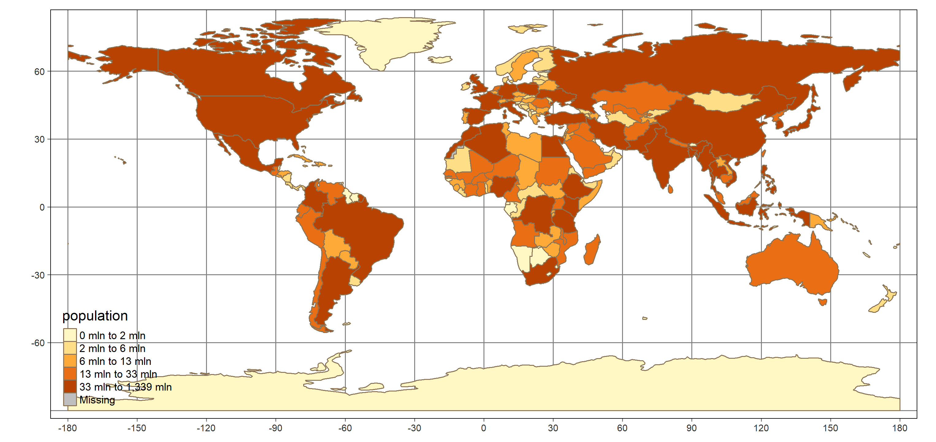
library(tmap)
qtm(shp = countries_spdf, fill = "population")How easy was that!? Can you make a choropleth of another variable contained in countries_spdf: gdp?
p_load(tmap)
# Use qtm() to create a choropleth map of gdp
qtm(shp = countries_spdf, fill = "gdp")## Linking to GEOS 3.8.0, GDAL 3.0.4, PROJ 6.3.1
Introduction to tmap
tmap displays spatial data
- Similar philsophy to
ggplot2:- a plot is built up in layers
ggplot2expects data in data frames,tmapexpects data in spatial objects- layers consist of a type of graphical representation and mapping from visual properties to variables


Key differences to ggplot2
- no
scale_equivalents, tweaks to scales happen in relevant layer call tm_shape()defines default data for any subsequent layers, so you can have many in a single plot- no need for
xandyaesthetics, these are inherent in spatial objects - no special evaluation, when mapping variables they must be quoted
Building a plot in layers
Now that you know a bit more about tmap(), let’s build up your previous plot of population in layers and make a few tweaks to improve it. You start with a tm_shape() layer that defines the data you want to use, then add a tm_fill() layer to color-in your polygons using the variable population:
tm_shape(countries_spdf) +
tm_fill(col = "population") Probably the biggest problem with the resulting plot is that the color scale isn’t very informative: the first color (palest yellow) covers all countries with population less than 200 million! Since the color scale is associated with the tm_fill() layer, tweaks to this scale happen in this call. You’ll learn a lot more about color in Chapter 3, but for now, know that the style argument controls how the breaks are chosen.
Your plot also needs some country outlines. You can add a tm_borders() layer for this, but let’s not make them too visually strong. Perhaps a brown would be nice.
The benefit of using spatial objects becomes really clear when you switch the kind of plot you make. Let’s also try a bubble plot where the size of the bubbles correspond to population. If you were using ggplot2, this would involve a lot of reshaping of your data. With tmap, you just switch out a layer.
# Add style argument to the tm_fill() call
tm_shape(countries_spdf) +
tm_fill(col = "population", style = "quantile") +
# Add a tm_borders() layer
tm_borders(col = "burlywood4") 
# New plot, with tm_bubbles() instead of tm_fill()
tm_shape(countries_spdf) +
tm_bubbles(size = "population") +
tm_borders(col = "burlywood4") ## Legend labels were too wide. Therefore, legend.text.size has been set to 0.66. Increase legend.width (argument of tm_layout) to make the legend wider and therefore the labels larger.## The legend is too narrow to place all symbol sizes.
Why is Greenland so big? Take a closer look at the plot. Why does Greenland look bigger than the contiguous US when it’s actually only about one-third the size?
When you plot longitude and latitude locations on the x- and y-axes of a plot, you are treating 1 degree of longitude as the same size no matter where you are. However, because the earth is roughly spherical, the distance described by 1 degree of longitude depends on your latitude, varying from 111km at the equator, to 0 km at the poles.
The way you have taken positions on a sphere and drawn them in a two dimensional plane is described by a projection. The default you’ve used here (also known as an Equirectangular projection) distorts the width of areas near the poles. Every projection involves some kind of distortion (since a sphere isn’t a plane!), but different projections try to preserve different properties (e.g. areas, angles or distances).
In tmap, tm_shape() takes an argument projection that allows you to swap projections for the plot.
(Note: changing the projection of a ggplot2 plot is done using the coord_map() function. See ?coord_map() for more details.)
# Switch to a Hobo–Dyer projection
hd <- "+proj=cea +lon_0=0 +lat_ts=37.5 +x_0=0 +y_0=0 +ellps=WGS84 +units=m +no_defs"
tm_shape(countries_spdf, projection = hd) +
tm_grid(n.x = 11, n.y = 11) +
tm_fill(col = "population", style = "quantile") +
tm_borders(col = "burlywood4") 
# Switch to a Robinson projection
robin <- "+proj=robin +lon_0=0 +x_0=0 +y_0=0 +ellps=WGS84 +datum=WGS84 +units=m +no_defs"
tm_shape(countries_spdf, projection = robin) +
tm_grid(n.x = 11, n.y = 11) +
tm_fill(col = "population", style = "quantile") +
tm_borders(col = "burlywood4") 
# Add tm_style("classic") to your plot
tm_shape(countries_spdf, projection = robin) +
tm_grid(n.x = 11, n.y = 11) +
tm_fill(col = "population", style = "quantile") +
tm_borders(col = "burlywood4") +
tm_style("classic")
Great work! You are a map-making machine!
Saving a tmap plot
Saving tmap plots is easy with the tmap_save() function. The first argument, tm, is the plot to save, and the second, filename, is the file to save it to. If you leave tm unspecified, the last tmap plot printed will be saved.
The extension of the file name specifies the file type, for example .png or .pdf for static plots. One really neat thing about tmap is that you can save an interactive version which leverages the leaflet package. To get an interactive version, use tmap_save() but use the file name extension .html.
# Plot from last exercise
longlat <- "+proj=longlat +datum=WGS84"
Map <- tm_shape(countries_spdf) +
tm_grid(n.x = 11, n.y = 11, projection = longlat) +
tm_fill(col = "population", style = "quantile") +
tm_borders(col = "burlywood4")
Map
# Save a static version "population.png"
tmap_save(tm = Map, filename = "_images/population.png")
# Save an interactive version "population.html"
tmap_save(tm = Map, filename = "_html/population.html")Take a look at your static map and interactive map.
The raster package


What’s a raster object?
Just like sp classes, the raster classes have methods to help with basic viewing and manipulation of objects, like print() and summary(), and you can always dig deeper into their structure with str().
Let’s jump in and take a look at a raster we’ve loaded for you, pop. Keep an eye out for a few things:
- Can you see where the coordinate information is kept?
- Can you tell from the
summary()how big the raster is? - What do you think might be stored in this raster?
pop <- readRDS(file = "_data/03-population.rds")
p_load(raster)
# Print pop
pop## class : RasterLayer
## dimensions : 480, 660, 316800 (nrow, ncol, ncell)
## resolution : 0.008333333, 0.008333333 (x, y)
## extent : -75, -69.5, 39, 43 (xmin, xmax, ymin, ymax)
## crs : +proj=longlat +datum=NAD83 +no_defs +ellps=GRS80 +towgs84=0,0,0
## source : memory
## names : num_people
## values : 0, 41140 (min, max)# Call str() on pop, with max.level = 2
str(pop, max.level = 2)## Formal class 'RasterLayer' [package "raster"] with 12 slots
## ..@ file :Formal class '.RasterFile' [package "raster"] with 13 slots
## ..@ data :Formal class '.SingleLayerData' [package "raster"] with 13 slots
## ..@ legend :Formal class '.RasterLegend' [package "raster"] with 5 slots
## ..@ title : chr(0)
## ..@ extent :Formal class 'Extent' [package "raster"] with 4 slots
## ..@ rotated : logi FALSE
## ..@ rotation:Formal class '.Rotation' [package "raster"] with 2 slots
## ..@ ncols : int 660
## ..@ nrows : int 480
## ..@ crs :Formal class 'CRS' [package "sp"] with 1 slot
## ..@ history : list()
## ..@ z : list()# Call summary on pop
summary(pop)## num_people
## Min. 0
## 1st Qu. 0
## Median 0
## 3rd Qu. 23
## Max. 41140
## NA's 0Some useful methods
pop is a RasterLayer object, which contains the population around the Boston and NYC areas. Each grid cell simply contains a count of the number of people that live inside that cell.
You saw in the previous exercise that print() gives a useful summary of the object including the coordinate reference system, the size of the grid (both in number of rows and columns and geographical coordinates), and some basic info on the values stored in the grid. But it was very succinct; what if you want to see some of the values in the object?
The first way is to simply plot() the object. There is a plot() method for raster objects that creates a heatmap of the values.
If you want to extract the values from a raster object you can use the values() function, which pulls out a vector of the values. There are 316,800 values in the pop raster, so you won’t want to print them all out, but you can use str() and head() to take a peek.
# Call plot() on pop
plot(pop)
# Call str() on values(pop)
str(values(pop))## int [1:316800] 15 13 12 12 12 5 3 3 4 4 ...# Call head() on values(pop)
head(values(pop))## [1] 15 13 12 12 12 5A more complicated object
The raster package provides the RasterLayer object, but also a couple of more complicated objects: RasterStack and RasterBrick. These two objects are designed for storing many rasters, all of the same extents and dimension (a.k.a. multi-band, or multi-layer rasters).
You can think of RasterLayer like a matrix, but RasterStack and RasterBrick objects are more like three dimensional arrays. One additional thing you need to know to handle them is how to specify a particular layer.
You can use $ or [[ subsetting on a RasterStack or RasterBrick to grab one layer and return a new RasterLayer object. For example, if x is a RasterStack, x$layer_name or x[["layer_name"]] will return a RasterLayer with only the layer called layer_name in it.
Let’s look at a RasterStack object called pop_by_age that covers the same area as pop but now contains layers for population broken into few different age groups.
pop_by_age <- readRDS(file = "_data/03-population-by-age.rds")
# Print pop_by_age
pop_by_age## class : RasterStack
## dimensions : 480, 660, 316800, 7 (nrow, ncol, ncell, nlayers)
## resolution : 0.008333333, 0.008333333 (x, y)
## extent : -75, -69.5, 39, 43 (xmin, xmax, ymin, ymax)
## crs : +proj=longlat +datum=NAD83 +no_defs +ellps=GRS80 +towgs84=0,0,0
## names : under_1, age_1_4, age_5_17, age_18_24, age_25_64, age_65_79, age_80_over
## min values : 0, 0, 0, 0, 0, 0, 0
## max values : 698, 2467, 8017, 7714, 29263, 3720, 1743# Subset out the under_1 layer using [[
pop_by_age[["under_1"]]## class : RasterLayer
## dimensions : 480, 660, 316800 (nrow, ncol, ncell)
## resolution : 0.008333333, 0.008333333 (x, y)
## extent : -75, -69.5, 39, 43 (xmin, xmax, ymin, ymax)
## crs : +proj=longlat +datum=NAD83 +no_defs +ellps=GRS80 +towgs84=0,0,0
## source : memory
## names : under_1
## values : 0, 698 (min, max)# Plot the under_1 layer
plot(pop_by_age[["under_1"]])
A package that uses Raster objects
You saw the tmap package makes visualizing spatial classes in sp easy. The good news is that it works with the raster classes too! You simply pass your Raster___ object as the shp argument to the tm_shape() function, and then add a tm_raster() layer like this:
tm_shape(raster_object) +
tm_raster()When working with a RasterStack or a RasterBrick object, such as the pop_by_age object you created in the last exercise, you can display one of its layers using the col (short for “color”) argument in tm_raster(), surrounding the layer name in quotes.
You’ll work with tmap throughout the course, but we also want to show you another package, rasterVis, also designed specifically for visualizing raster objects. There are a few different functions you can use in rasterVis to make plots, but let’s just try one of them for now: levelplot().
# Specify pop as the shp and add a tm_raster() layer
tm_shape(pop) +
tm_raster()
# Plot the under_1 layer in pop_by_age
tm_shape(pop_by_age$under_1) +
tm_raster(col = "under_1")
p_load(rasterVis)
# Call levelplot() on pop
levelplot(pop)
None of these plots are very informative, because the color scales aren’t great. Let’s work on that next.
Color scales


Adding a custom continuous color palette to ggplot2 plots
The most versatile way to add a custom continuous scale to ggplot2 plots is with scale_color_gradientn() or scale_fill_gradientn(). How do you know which to use? Match the function to the aesthetic you have mapped. For example, in your plot of predicted house price from Chapter 1, you mapped fill to price, so you’d need to use scale_fill_gradientn().
These two functions take an argument colors where you pass a vector of colors that defines your palette. This is where the versatility comes in. You can generate your palette in any way you choose, automatically using something like RColorBrewer or viridisLite, or manually by specifying colors by name or hex code.
The scale___gradientn() functions handle how these colors are mapped to values of your variable, although there is control available through the values argument.
Let’s play with some alternative color scales for your predicted house price heatmap from Chapter 1 (we’ve dropped the map background to reduce computation time, so you can see your plots quickly).
p_load(RColorBrewer)
# 9 steps on the RColorBrewer "BuPu" palette: blups
blups <- brewer.pal(n = 9, "BuPu")
# Add scale_fill_gradientn() with the blups palette
ggplot(preds) +
geom_tile(aes(lon, lat, fill = predicted_price), alpha = 0.8) +
scale_fill_gradientn(colors = blups)
p_load(viridisLite)
# viridisLite viridis palette with 9 steps: vir
vir <- viridis(n = 9)
# Add scale_fill_gradientn() with the vir palette
ggplot(preds) +
geom_tile(aes(lon, lat, fill = predicted_price), alpha = 0.8) + scale_fill_gradientn(colors = vir) 
# mag: a viridisLite magma palette with 9 steps
mag <- magma(n = 9)
# Add scale_fill_gradientn() with the mag palette
ggplot(preds) +
geom_tile(aes(lon, lat, fill = predicted_price), alpha = 0.8) + scale_fill_gradientn(colors = mag)
If you know you want a RColorBrewer palette, there is a shortcut. Add scale_xxx_distiller and you only need to specify the palette name in the palette argument. See ?scale_fill_distiller.
Custom palette in tmap
Unlike ggplot2, where setting a custom color scale happens in a scale_ call, colors in tmap layers are specified in the layer in which they are mapped. For example, take a plot of the age_18_24 variable from prop_by_age:
tm_shape(prop_by_age) +
tm_raster(col = "age_18_24") Since color is mapped in the tm_raster() call, the specification of the palette also occurs in this call. You simply specify a vector of colors in the palette argument. This is a another reason it’s worth learning ways to generate a vector of colors. While different packages could have very different shortcuts for specifying palettes from color packages, they will generally always have a way to pass in a vector of colors.
Let’s use some palettes from the last exercise with this plot.
prop_by_age <- readRDS(file = "_data/03-proportion-by-age.rds")
# Use the blups palette
tm_shape(prop_by_age$age_18_24) +
tm_raster(palette = blups) +
tm_legend(position = c("right", "bottom"))
# Use the vir palette
tm_shape(prop_by_age$age_18_24) +
tm_raster(palette = vir) +
tm_legend(position = c("right", "bottom"))
# Use the mag palette but reverse the order
tm_shape(prop_by_age$age_18_24) +
tm_raster(palette = rev(mag)) +
tm_legend(position = c("right", "bottom"))
More about color scales

Discrete vs. continuous mapping
- Continuous:
- perceptually uniform: perceiving equivalent color difference to numerical difference
- Discrete:
- complete control over scale
- easier lookup


An interval scale example
Let’s return to your plot of the proportion of the population that is between 18 and 24:
tm_shape(prop_by_age$age_18_24) +
tm_raster(palette = vir) +
tm_legend(position = c("right", "bottom"))Your plot was problematic because most of the proportions fell in the lowest color level and consequently you didn’t see much detail in your plot. One way to solve this problem is this: instead of breaking the range of your variable into equal length bins, you can break it into more useful categories.
Let’s start by replicating the tmap default bins: five categories, cut using "pretty" breaks. Then you can try out a few of the other methods to cut a variable into intervals. Using the classIntervals() function directly gives you quick feedback on what the breaks will be, but the best way to try out a set of breaks is to plot them.
(As an aside, another way to solve this kind of problem is to look for a transform of the variable so that equal length bins of the transformed scale are more useful.)
mag <- viridisLite::magma(7)
p_load(classInt)
# Create 5 "pretty" breaks with classIntervals()
classIntervals(values(prop_by_age[["age_18_24"]]),
n = 5, style = "pretty")## Warning in classIntervals(values(prop_by_age[["age_18_24"]]), n = 5, style =
## "pretty"): var has missing values, omitted in finding classes## style: pretty
## [0,0.2) [0.2,0.4) [0.4,0.6) [0.6,0.8) [0.8,1]
## 130770 1775 302 170 138# Create 5 "quantile" breaks with classIntervals()
classIntervals(values(prop_by_age[["age_18_24"]]),
n = 5, style = "quantile")## Warning in classIntervals(values(prop_by_age[["age_18_24"]]), n = 5, style =
## "quantile"): var has missing values, omitted in finding classes## style: quantile
## [0,0) [0,0.04054054) [0.04054054,0.05882353)
## 0 53218 25925
## [0.05882353,0.08108108) [0.08108108,1]
## 27217 26795# Use 5 "quantile" breaks in tm_raster()
tm_shape(prop_by_age$age_18_24) +
tm_raster(palette = mag, style = "quantile") +
tm_legend(position = c("right", "bottom"))
# Create histogram of proportions
hist(values(prop_by_age)[, "age_18_24"])
# Use fixed breaks in tm_raster()
Map <- tm_shape(prop_by_age$age_18_24) +
tm_raster(palette = mag,
style = "fixed", breaks = c(0.025, 0.05, 0.1, 0.2, 0.25, 0.3, 1))
Map## Warning: Values have found that are less than the lowest break
# Save your plot to "_html/prop_18-24.html"
tmap_save(tm = Map, filename = "_html/prop_18-24.html")## Warning: Values have found that are less than the lowest breakTake look at your interactive version! Do you have any ideas for out what the areas are with a very high proportion of 18-24 year olds? Zoom in on one and see if you are right.
A diverging scale example
Let’s take a look at another dataset where the default color scale isn’t appropriate. This raster, migration, has an estimate of the net number of people who have moved into each cell of the raster between the years of 1990 and 2000. A positive number indicates a net immigration, and a negative number an emigration. Take a look:
tm_shape(migration) +
tm_raster() +
tm_legend(outside = TRUE,
outside.position = c("bottom"))The default color scale doesn’t look very helpful, but tmap is actually doing something quite clever: it has automatically chosen a diverging color scale. A diverging scale is appropriate since large movements of people are large positive numbers or large (in magnitude) negative numbers. Zero (i.e. no net migration) is a natural midpoint.
tmap chooses a diverging scale when there are both positive and negative values in the mapped variable and chooses zero as the midpoint. This isn’t always the right approach. Imagine you are mapping a relative change as percentages; 100% might be the most intuitive midpoint. If you need something different, the best way to proceed is to generate a diverging palette (with an odd number of steps, so there is a middle color) and specify the breaks yourself.
Let’s see if you can get a more informative map by adding a diverging scale yourself.
(Data source: de Sherbinin, A., M. Levy, S. Adamo, K. MacManus, G. Yetman, V. Mara, L. Razafindrazay, B. Goodrich, T. Srebotnjak, C. Aichele, and L. Pistolesi. 2015. Global Estimated Net Migration Grids by Decade: 1970-2000. Palisades, NY: NASA Socioeconomic Data and Applications Center (SEDAC). http://dx.doi.org/10.7927/H4319SVC Accessed 27 Sep 2016)
migration <- readRDS(file = "_data/03_migration.rds")
# Print migration
migration## class : RasterLayer
## dimensions : 49, 116, 5684 (nrow, ncol, ncell)
## resolution : 0.5, 0.5 (x, y)
## extent : -125, -67, 25, 49.5 (xmin, xmax, ymin, ymax)
## crs : +proj=longlat +datum=WGS84 +no_defs +ellps=WGS84 +towgs84=0,0,0
## source : memory
## names : net_migration
## values : -4560234, 806052.2 (min, max)# Diverging "RdGy" palette
red_gray <- brewer.pal(7, "RdGy")
# Use red_gray as the palette
tm_shape(migration) +
tm_raster(palette = red_gray) +
tm_legend(outside = TRUE, outside.position = c("bottom"))## Variable(s) "NA" contains positive and negative values, so midpoint is set to 0. Set midpoint = NA to show the full spectrum of the color palette.
# Add fixed breaks
tm_shape(migration) +
tm_raster(palette = red_gray, style = "fixed",
breaks = c(-5e6, -5e3, -5e2, -5e1, 5e1, 5e2, 5e3, 5e6)) +
tm_legend(outside = TRUE, outside.position = c("bottom"))## Variable(s) "NA" contains positive and negative values, so midpoint is set to 0. Set midpoint = NA to show the full spectrum of the color palette.
Finally, you have a useful map. Can you see the migration into the South, away from Mexico, and away from parts of the northeast?
A qualitative example
Finally, let’s look at an example of a categorical variable. The land_cover raster contains a gridded categorization of the earth’s surface. Have a look at land_cover by printing it:
land_coverYou will notice that the values are numeric, but there are attributes that map these numbers to categories (just like the way factors work).
Choosing colors for categorical variables depends a lot on the purpose of the graphic. When you want the categories to have roughly equal visual weight – that is, you don’t want one category to stand out more than the others – one approach is to use colors of varying hues, but equal chroma (a measure of vibrancy) and lightness (this is default for discrete color scales in ggplot2 and can be generated using the hcl() function).
The RColorBrewer qualitative palettes balance having equal visual weight colors with ease of color identification. The "paired" and "accent" schemes deviate from this by providing pairs of colors of different lightness and a palette with some more intense colors that may be used to highlight certain categories, respectively.
For this particular data, it might make more sense to choose intuitive colors, like green for forest and blue for water. Whichever is more appropriate, setting new colors is just a matter of passing in a vector of colors through the palette argument in the corresponding tm_*** layer.
library(raster)
# Plot land_cover
tm_shape(land_cover) +
tm_raster() 
# Palette like the ggplot2 default
hcl_cols <- hcl(h = seq(15, 375, length = 9),
c = 100, l = 65)[-9]
# Use hcl_cols as the palette
tm_shape(land_cover) +
tm_raster(palette = hcl_cols) 
# Examine land_cover
str(land_cover)
summary(land_cover)Formal class 'RasterLayer' [package "raster"] with 12 slots
..@ file :Formal class '.RasterFile' [package "raster"] with 13 slots
.. .. ..@ name : chr ""
.. .. ..@ datanotation: chr "FLT4S"
.. .. ..@ byteorder : chr "little"
.. .. ..@ nodatavalue : num -Inf
.. .. ..@ NAchanged : logi FALSE
.. .. ..@ nbands : int 1
.. .. ..@ bandorder : chr "BIL"
.. .. ..@ offset : int 0
.. .. ..@ toptobottom : logi TRUE
.. .. ..@ blockrows : int 0
.. .. ..@ blockcols : int 0
.. .. ..@ driver : chr ""
.. .. ..@ open : logi FALSE
..@ data :Formal class '.SingleLayerData' [package "raster"] with 13 slots
.. .. ..@ values : int [1:583200] 8 8 8 8 8 8 8 8 8 8 ...
.. .. ..@ offset : num 0
.. .. ..@ gain : num 1
.. .. ..@ inmemory : logi TRUE
.. .. ..@ fromdisk : logi FALSE
.. .. ..@ isfactor : logi FALSE
.. .. ..@ attributes: list()
.. .. ..@ haveminmax: logi TRUE
.. .. ..@ min : int 1
.. .. ..@ max : int 8
.. .. ..@ band : int 1
.. .. ..@ unit : chr ""
.. .. ..@ names : chr "cover_cls"
..@ legend :Formal class '.RasterLegend' [package "raster"] with 5 slots
.. .. ..@ type : chr(0)
.. .. ..@ values : logi(0)
.. .. ..@ color : logi(0)
.. .. ..@ names : logi(0)
.. .. ..@ colortable: logi(0)
..@ title : chr(0)
..@ extent :Formal class 'Extent' [package "raster"] with 4 slots
.. .. ..@ xmin: num -180
.. .. ..@ xmax: num 180
.. .. ..@ ymin: num -90
.. .. ..@ ymax: num 90
..@ rotated : logi FALSE
..@ rotation:Formal class '.Rotation' [package "raster"] with 2 slots
.. .. ..@ geotrans: num(0)
.. .. ..@ transfun:function ()
..@ ncols : int 1080
..@ nrows : int 540
..@ crs :Formal class 'CRS' [package "sp"] with 1 slot
.. .. ..@ projargs: chr "+proj=longlat +datum=WGS84 +no_defs +ellps=WGS84 +towgs84=0,0,0"
..@ history : list()
..@ z : list() cover_cls
Min. 1
1st Qu. 7
Median 8
3rd Qu. 8
Max. 8
NA's 0# A set of intuitive colors
intuitive_cols <- c(
"darkgreen",
"darkolivegreen4",
"goldenrod2",
"seagreen",
"wheat",
"slategrey",
"white",
"lightskyblue1"
)
# Use intuitive_cols as palette
tm_shape(land_cover) +
tm_raster(palette = intuitive_cols) +
tm_legend(position = c("left", "bottom"))
Reading in spatial data


Reading in a shapefile
Shapefiles are one of the most common ways spatial data are shared and are easily read into R using readOGR() from the rgdal package. readOGR() has two important arguments: dsn and layer. Exactly what you pass to these arguments depends on what kind of data you are reading in. You learned in the video that for shapefiles, dsn should be the path to the directory that holds the files that make up the shapefile and layer is the file name of the particular shapefile (without any extension).
For your map, you want neighborhood boundaries. We downloaded the Neighborhood Tabulation Areas, as defined by the City of New York, from the Open Data Platform of the Department of City Planning. The download was in the form of a zip archive and we have put the result of unzipping the downloaded file in your working directory.
You’ll use the dir() function from base R to examine the contents of your working directory, then read in the shapefile to R.
p_load(sp, rgdal)
# The files below were created for the exercise based on data provided by the course instructor.
# These commands are run only one time and are thus commented
#nynta_16c <- readRDS(file = "_data/04_nynta_16c.rds")
#rgdal::writeOGR(nynta_16c, "_data/nynta_16c", "nynta", driver = "ESRI Shapefile")
# Use dir() to find directory name
#dir()
# Call dir() with directory name
dir("_data/nynta_16c")## [1] "nynta.dbf" "nynta.prj" "nynta.shp" "nynta.shx"# Read in shapefile with readOGR(): neighborhoods
neighborhoods <- readOGR("_data/nynta_16c", "nynta")## OGR data source with driver: ESRI Shapefile
## Source: "C:\Users\p1n3d\Documents\GitHub\R\DataCamp\_data\nynta_16c", layer: "nynta"
## with 195 features
## It has 7 fields# summary() of neighborhoods
summary(neighborhoods)## Object of class SpatialPolygonsDataFrame
## Coordinates:
## min max
## x 913175.1 1067382.5
## y 120121.9 272844.3
## Is projected: TRUE
## proj4string :
## [+proj=lcc +lat_0=40.1666666666667 +lon_0=-74 +lat_1=41.0333333333333
## +lat_2=40.6666666666667 +x_0=300000 +y_0=0 +datum=NAD83 +units=us-ft
## +no_defs]
## Data attributes:
## BoroCode BoroName CountyFIPS NTACode
## Min. :1 Length:195 Length:195 Length:195
## 1st Qu.:2 Class :character Class :character Class :character
## Median :3 Mode :character Mode :character Mode :character
## Mean :3
## 3rd Qu.:4
## Max. :5
## NTAName Shape_Leng Shape_Area
## Length:195 Min. : 11000 Min. : 5573902
## Class :character 1st Qu.: 23824 1st Qu.: 19392084
## Mode :character Median : 30550 Median : 32629789
## Mean : 42003 Mean : 43227674
## 3rd Qu.: 41877 3rd Qu.: 50237449
## Max. :490474 Max. :327759719# Plot neighborhoods
plot(neighborhoods)
Reading in a raster file
Raster files are most easily read in to R with the raster() function from the raster package. You simply pass in the filename (including the extension) of the raster as the first argument, x.
The raster() function uses some native raster package functions for reading in certain file types (based on the extension in the file name) and otherwise hands the reading of the file on to readGDAL() from the rgdal package. The benefit of not using readGDAL() directly is simply that raster() returns a RasterLayer object.
A common kind of raster file is the GeoTIFF, with file extension .tif or .tiff. We’ve downloaded a median income raster from the US census and put it in your working directory.
Let’s take a look and read it in.
p_load(raster)
# The files below were created for the exercise based on data provided by the course instructor.
# These commands are run only one time and are thus commented
#income_grid_raster <- readRDS(file = "_data/04_income_grid.rds")
#income_grid_raster <- raster(income_grid_raster)
#raster::writeRaster(income_grid_raster,"_data/nyc_grid_data/m5602ahhi00.tif", options=c('TFW=YES'))
# Call dir()
#dir()
# Call dir() on the directory
dir("_data/nyc_grid_data")## [1] "m5602ahhi00.tfw" "m5602ahhi00.tif"# Use raster() with file path: income_grid
income_grid <- raster("_data/nyc_grid_data/m5602ahhi00.tif")
# Call summary() on income_grid
summary(income_grid)## Warning in .local(object, ...): summary is an estimate based on a sample of 1e+05 cells (2.17% of all cells)## m5602ahhi00
## Min. 0
## 1st Qu. 0
## Median 0
## 3rd Qu. 0
## Max. 213845
## NA's 0# Call plot() on income_grid
plot(income_grid)
These data are actually a little coarse for your purpose. Instead you’ll use income data at the census tract level in the following plots.
Getting data using a package
Reading in spatial data from a file is one way to get spatial data into R, but there are also some packages that provide commonly used spatial data. For example, the rnaturalearth package provides data from Natural Earth, a source of high resolution world maps including coastlines, states, and populated places. In fact, this was the source of the data from Chapter 2.
You will be examining median income at the census tract level in New York County (a.k.a. the Bourough of Manhattan), but to do this you’ll need to know the boundaries of the census tracts. The tigris package in R provides a way to easily download and import shapefiles based on US Census geographies. You’ll use the tracts() function to download tract boundaries, but tigris also provides states(), counties(), places() and many other functions that match the various levels of geographic entities defined by the Census.
Let’s grab the spatial data for the tracts.
p_load(tigris)
# Call tracts(): nyc_tracts
nyc_tracts <- tracts(state = "NY", county = "New York", cb = TRUE)##
|
| | 0%
|
|= | 1%
|
|= | 2%
|
|== | 3%
|
|=== | 4%
|
|==== | 5%
|
|==== | 6%
|
|===== | 7%
|
|====== | 8%
|
|====== | 9%
|
|======= | 10%
|
|======= | 11%
|
|======== | 11%
|
|======== | 12%
|
|========= | 13%
|
|========== | 14%
|
|========== | 15%
|
|=========== | 16%
|
|============ | 17%
|
|============= | 18%
|
|============== | 19%
|
|============== | 20%
|
|=============== | 21%
|
|=============== | 22%
|
|================ | 22%
|
|================ | 23%
|
|================= | 24%
|
|================== | 25%
|
|================== | 26%
|
|=================== | 27%
|
|==================== | 28%
|
|==================== | 29%
|
|===================== | 30%
|
|===================== | 31%
|
|====================== | 31%
|
|====================== | 32%
|
|======================= | 33%
|
|======================== | 34%
|
|========================= | 36%
|
|========================== | 37%
|
|=========================== | 38%
|
|=========================== | 39%
|
|============================ | 39%
|
|============================ | 40%
|
|============================ | 41%
|
|============================= | 42%
|
|============================== | 43%
|
|=============================== | 44%
|
|================================ | 45%
|
|================================ | 46%
|
|================================= | 47%
|
|================================= | 48%
|
|================================== | 48%
|
|================================== | 49%
|
|=================================== | 50%
|
|==================================== | 51%
|
|==================================== | 52%
|
|===================================== | 53%
|
|====================================== | 54%
|
|======================================= | 55%
|
|======================================= | 56%
|
|======================================== | 56%
|
|======================================== | 57%
|
|========================================= | 58%
|
|========================================= | 59%
|
|========================================== | 60%
|
|=========================================== | 61%
|
|=========================================== | 62%
|
|============================================ | 63%
|
|============================================= | 64%
|
|============================================== | 65%
|
|============================================== | 66%
|
|=============================================== | 67%
|
|=============================================== | 68%
|
|================================================ | 69%
|
|================================================= | 70%
|
|================================================== | 71%
|
|=================================================== | 72%
|
|=================================================== | 73%
|
|==================================================== | 74%
|
|===================================================== | 75%
|
|===================================================== | 76%
|
|====================================================== | 76%
|
|====================================================== | 78%
|
|======================================================= | 79%
|
|======================================================== | 80%
|
|========================================================= | 81%
|
|========================================================= | 82%
|
|========================================================== | 82%
|
|========================================================== | 83%
|
|=========================================================== | 84%
|
|=========================================================== | 85%
|
|============================================================ | 85%
|
|============================================================ | 86%
|
|============================================================= | 87%
|
|============================================================= | 88%
|
|============================================================== | 89%
|
|=============================================================== | 90%
|
|================================================================ | 91%
|
|================================================================= | 92%
|
|================================================================= | 93%
|
|================================================================== | 94%
|
|================================================================== | 95%
|
|=================================================================== | 95%
|
|=================================================================== | 96%
|
|==================================================================== | 97%
|
|===================================================================== | 98%
|
|===================================================================== | 99%
|
|======================================================================| 100%nyc_tracts <- as_Spatial(nyc_tracts)
# Call summary() on nyc_tracts
summary(nyc_tracts)## Object of class SpatialPolygonsDataFrame
## Coordinates:
## min max
## x -74.04731 -73.90700
## y 40.68419 40.88208
## Is projected: FALSE
## proj4string : [+proj=longlat +datum=NAD83 +no_defs]
## Data attributes:
## STATEFP COUNTYFP TRACTCE AFFGEOID
## Length:288 Length:288 Length:288 Length:288
## Class :character Class :character Class :character Class :character
## Mode :character Mode :character Mode :character Mode :character
##
##
##
## GEOID NAME LSAD ALAND
## Length:288 Length:288 Length:288 Min. : 41338
## Class :character Class :character Class :character 1st Qu.: 134553
## Mode :character Mode :character Mode :character Median : 175545
## Mean : 203787
## 3rd Qu.: 202707
## Max. :2992159
## AWATER
## Min. : 0
## 1st Qu.: 0
## Median : 0
## Mean : 99103
## 3rd Qu.: 111564
## Max. :3393360# Plot nyc_tracts
plot(nyc_tracts)
In case you were wondering, the final argument cb = TRUE downloads the lower resolution boundaries which makes for a quicker download.
Coordinate reference systems


Merging data from different CRS/projections
Every spatial object has a coordinate reference system (CRS) associated with it. Generally, this is set when the data are imported and will be read directly from the spatial files. This is how the neighborhoods and nyc_tracts obtained their coordinate system information.
Both the sp and raster packages have a proj4string() function that returns the CRS of the object it’s called on.
Trying to work with spatial data using different CRSs is a bit like trying to work with a dataset in miles and another in kilometers. They are measuring the same thing, but the numbers aren’t directly comparable.
Let’s take a look at our two polygon objects.
# proj4string() on nyc_tracts and neighborhoods
proj4string(nyc_tracts)## Warning in proj4string(nyc_tracts): CRS object has comment, which is lost in
## output## [1] "+proj=longlat +datum=NAD83 +no_defs"proj4string(neighborhoods)## Warning in proj4string(neighborhoods): CRS object has comment, which is lost in
## output## [1] "+proj=lcc +lat_0=40.1666666666667 +lon_0=-74 +lat_1=41.0333333333333 +lat_2=40.6666666666667 +x_0=300000 +y_0=0 +datum=NAD83 +units=us-ft +no_defs"# coordinates() on nyc_tracts and neighborhoods
head(coordinates(nyc_tracts))## [,1] [,2]
## 11 -73.97312 40.80183
## 12 -73.97050 40.76484
## 16 -73.95492 40.76280
## 17 -73.95098 40.77881
## 46 -73.92498 40.86749
## 48 -73.94619 40.81865head(coordinates(neighborhoods))## [,1] [,2]
## 0 987397.5 169148.4
## 1 1037640.2 214077.6
## 2 1043002.7 212969.8
## 3 1037005.2 219265.3
## 4 1020706.7 217413.9
## 5 1011274.1 240777.4# plot() neighborhoods and nyc_tracts
plot(neighborhoods)
plot(nyc_tracts, add = TRUE, col = "red")
Why didn’t we see the tracts on our plot of neighborhoods? Simply because the coordinates of the tracts put them way off the boundaries of our plot.
Converting from one CRS/projection to another
The process of converting from one CRS or projection to another is handled by the spTransform() methods in the rgdal package. spTransform() has methods for all sp objects including SpatialPolygonsDataFrame, but doesn’t work on raster objects. This is because transforming a raster is a little more complicated; the transformed rectangular grid will no longer be rectangular. You can look at ?raster::projectRaster if you are curious about transforming rasters.
Transformation is simple. The first argument to spTransform(), x, is the spatial object to be transformed and the second, CRS, is a specification of the desired CRS. The CRS can be specified by a PROJ4 string, which you could construct by hand, but it’s much easier to take it from an existing object (e.g. with the proj4string() function).
Time to get your two polygons datasets into the same CRS.
water <- readRDS(file = "_data/04_water_big.rds")
# Use spTransform on neighborhoods: neighborhoods
neighborhoods <- spTransform(neighborhoods,
proj4string(nyc_tracts))## Warning in proj4string(nyc_tracts): CRS object has comment, which is lost in
## output# head() on coordinates() of neighborhoods
head(coordinates(neighborhoods))## [,1] [,2]
## 0 -73.98866 40.63095
## 1 -73.80729 40.75411
## 2 -73.78795 40.75104
## 3 -73.80955 40.76835
## 4 -73.86840 40.76335
## 5 -73.90235 40.82751# Plot neighborhoods, nyc_tracts and water
plot(neighborhoods)
plot(nyc_tracts, add = TRUE, col = "red")
plot(water, add = TRUE, col = "blue")
If you plot the untransformed objects with tmap, it actually does this transformation on the fly, but it’s useful to know how to do it manually.
Adding data to spatial objects


Adding new data
- once created, no checks that data stay matched to polygons
- recreate object being very careful to match polygons to the right rows
sp::merge(),merge()forspobjects
The wrong way
When a Spatial***DataFrame object is created, there are two ways the spatial objects (e.g. Polygons) might be matched up to the rows of the data. The most robust is to use IDs on the spatial objects that are matched up to row names in the data. This ensures if there are any that don’t match you are quickly alerted. The other way is simply by order – the first spatial object is assumed to correspond to the first row of data.
Once created, the correspondence is based purely on order. If you manipulate the data slot, there is no checking the spatial objects still correspond to the right rows. What does this mean in practice? It’s very dangerous to manipulate the data slot directly!
To create your plot of income, you need to match up the income data frame with the tracts SpatialPolygonsDataFrame. To illustrate the danger of manipulating @data directly, let’s see what happens if you try to force nyc_income in to nyc_tracts.
nyc_income <- readRDS(file = "_data/04_nyc_income.rds")
# Use str() on nyc_income
str(nyc_income)## 'data.frame': 288 obs. of 6 variables:
## $ name : chr "Census Tract 1, New York County, New York" "Census Tract 2.01, New York County, New York" "Census Tract 2.02, New York County, New York" "Census Tract 5, New York County, New York" ...
## $ state : int 36 36 36 36 36 36 36 36 36 36 ...
## $ county : int 61 61 61 61 61 61 61 61 61 61 ...
## $ tract : chr "000100" "000201" "000202" "000500" ...
## $ estimate: num NA 23036 29418 NA 18944 ...
## $ se : num NA 3083 1877 NA 1442 ...# ...and on nyc_tracts@data
str(nyc_tracts@data)## 'data.frame': 288 obs. of 9 variables:
## $ STATEFP : chr "36" "36" "36" "36" ...
## $ COUNTYFP: chr "061" "061" "061" "061" ...
## $ TRACTCE : chr "019100" "011401" "011600" "014602" ...
## $ AFFGEOID: chr "1400000US36061019100" "1400000US36061011401" "1400000US36061011600" "1400000US36061014602" ...
## $ GEOID : chr "36061019100" "36061011401" "36061011600" "36061014602" ...
## $ NAME : chr "191" "114.01" "116" "146.02" ...
## $ LSAD : chr "CT" "CT" "CT" "CT" ...
## $ ALAND : num 223477 98508 195588 109175 135565 ...
## $ AWATER : num 175654 0 132923 0 0 ...# Highlight tract 002201 in nyc_tracts
plot(nyc_tracts)
plot(nyc_tracts[nyc_tracts$TRACTCE == "002201", ],
col = "red", add = TRUE)
# Set nyc_tracts@data to nyc_income
#nyc_tracts@data <- nyc_income
# Highlight tract 002201 again
#plot(nyc_tracts)
#plot(nyc_tracts[nyc_tracts$tract == "002201", ],
# col = "red", add = TRUE)Notice how the row in the data for tract 002201 no longer corresponds to the right polygon. (I did not run the incorrect code in this case, but it is provided and commented)
Checking data will match
Forcing your data into the data slot doesn’t work because you lose the correct correspondence between rows and spatial objects. How do you add the income data to the polygon data? The merge() function in sp is designed exactly for this purpose.
You might have seen merge() before with data frames. sp::merge() has almost the exact same structure, but you pass it a Spatial*** object and a data frame and it returns a new Spatial*** object where the data slot is now a merge of the original data slot and the data frame. To do this merge, you’ll require both the spatial object and data frame to have a column that contains IDs to match on.
Both nyc_tracts and nyc_income have columns with tract IDs, so these are great candidates for merging the two datasets. However, it’s always a good idea to check that the proposed IDs are unique and that there is a match for every row in both datasets.
Let’s check this before moving on to the merge.
# Check for duplicates in nyc_income
any(duplicated(nyc_income$tract))## [1] FALSE# Check for duplicates in nyc_tracts
any(duplicated(nyc_tracts$TRACTCE))## [1] FALSE# Check nyc_tracts in nyc_income
all((nyc_tracts$TRACTCE %in% nyc_income$tract))## [1] TRUE# Check nyc_income in nyc_tracts
all((nyc_income$tract %in% nyc_tracts$TRACTCE))## [1] TRUELooks like the tract column in nyc_income and the TRACTCE column in nyc_income are ideal for merging on.
Merging data attributes
merge() by default merges based on columns with the same name in both datasets. In your case, this isn’t appropriate since the column of IDs is called tract in one dataset and TRACTCE in the other. To handle this, merge() has the optional arguments by.x and by.y, where you can specify the names of the column to merge on in the two datasets, respectively.
merge() returns a new Spatial___DataFrame object, so you can take a look at the result by plotting it with tmap.
Let’s go ahead and merge.
p_load(sp, tmap, rgeos)
# Merge nyc_tracts and nyc_income: nyc_tracts_merge
nyc_tracts_merge <- merge(nyc_tracts, nyc_income, by.x = "TRACTCE", by.y = "tract")
# Call summary() on nyc_tracts_merge
summary(nyc_tracts_merge)## Object of class SpatialPolygonsDataFrame
## Coordinates:
## min max
## x -74.04731 -73.90700
## y 40.68419 40.88208
## Is projected: FALSE
## proj4string : [+proj=longlat +datum=NAD83 +no_defs]
## Data attributes:
## TRACTCE STATEFP COUNTYFP AFFGEOID
## Length:288 Length:288 Length:288 Length:288
## Class :character Class :character Class :character Class :character
## Mode :character Mode :character Mode :character Mode :character
##
##
##
##
## GEOID NAME LSAD ALAND
## Length:288 Length:288 Length:288 Min. : 41338
## Class :character Class :character Class :character 1st Qu.: 134553
## Mode :character Mode :character Mode :character Median : 175545
## Mean : 203787
## 3rd Qu.: 202707
## Max. :2992159
##
## AWATER name state county
## Min. : 0 Length:288 Min. :36 Min. :61
## 1st Qu.: 0 Class :character 1st Qu.:36 1st Qu.:61
## Median : 0 Mode :character Median :36 Median :61
## Mean : 99103 Mean :36 Mean :61
## 3rd Qu.: 111564 3rd Qu.:36 3rd Qu.:61
## Max. :3393360 Max. :36 Max. :61
##
## estimate se
## Min. : 12479 Min. : 1117
## 1st Qu.: 39038 1st Qu.: 5107
## Median : 81786 Median : 8998
## Mean : 82405 Mean : 11678
## 3rd Qu.:112561 3rd Qu.: 14281
## Max. :232266 Max. :132737
## NA's :9 NA's :9# Choropleth with col mapped to estimate
tm_shape(nyc_tracts_merge) +
tm_fill(col = "estimate") ## Warning in sp::proj4string(obj): CRS object has comment, which is lost in output## Some legend labels were too wide. These labels have been resized to 0.53, 0.50, 0.50, 0.50. Increase legend.width (argument of tm_layout) to make the legend wider and therefore the labels larger.
A first plot
So far, you’ve read in some spatial files, transformed spatial data to the same projection, and merged a data frame with a spatial object. Time to put your work together and see how your map looks. For each dataset, you need a tm_shape() call to specify the data source, followed by a tm_* layer (like tm_fill(), tm_borders() or tm_bubbles()) to draw on the map.
First, you’ll add the neighborhoods and water areas to your plot from the previous exercise.
tm_shape(nyc_tracts_merge) +
tm_fill(col = "estimate") +
# Add a water layer, tm_fill() with col = "grey90"
tm_shape(water) +
tm_fill(col = "grey90") +
# Add a neighborhood layer, tm_borders()
tm_shape(neighborhoods) +
tm_borders() ## Warning in sp::proj4string(obj): CRS object has comment, which is lost in output## Some legend labels were too wide. These labels have been resized to 0.53, 0.50, 0.50, 0.50. Increase legend.width (argument of tm_layout) to make the legend wider and therefore the labels larger.
Looking good, but there are a few tweaks you might make to make it look even better.
Polishing a map
- remove distractions, let data shine
- useful spatial context
- like any plot: check legend, title, and labels for readability
- add annotations
- highlight important points
- attribute data sources


Subsetting the neighborhoods
You don’t need all those extraneous neighborhoods in New York, so you’ll subset out just the neighborhoods in New York County. You already know how!
neighborhoods is a SpatialPolygonsDataFrame and you learned back in Chapter 2 how to subset based on the column in the data slot. The key was creating a logical vector, then subsetting the SpatialPolygonsDataFrame like a data frame.
How can you identify the right neighborhoods? Check out:
head(neighborhoods@data)The CountyFIPS is a numeric code that identifies the county. If you can figure out the code for New York County, you can keep just the rows with that value.
head(neighborhoods@data)## BoroCode BoroName CountyFIPS NTACode NTAName Shape_Leng Shape_Area
## 0 3 Brooklyn 047 BK88 Borough Park 39247.23 54005019
## 1 4 Queens 081 QN52 East Flushing 25843.36 29454380
## 2 4 Queens 081 QN48 Auburndale 32446.88 34164218
## 3 4 Queens 081 QN51 Murray Hill 33266.90 52488277
## 4 4 Queens 081 QN27 East Elmhurst 19816.71 19726846
## 5 2 Bronx 005 BX35 Morrisania-Melrose 27740.85 16891753# Find unique() nyc_tracts_merge$COUNTYFP
unique(nyc_tracts_merge$COUNTYFP)## [1] "061"# Add logical expression to pull out New York County
manhat_hoods <- neighborhoods[neighborhoods$CountyFIPS == "061", ]
tm_shape(nyc_tracts_merge) +
tm_fill(col = "estimate") +
tm_shape(water) +
tm_fill(col = "grey90") +
# Edit to use manhat_hoods instead
tm_shape(manhat_hoods) +
tm_borders() +
# Add a tm_text() layer
tm_text(text = "NTAName")## Warning in sp::proj4string(obj): CRS object has comment, which is lost in output## Some legend labels were too wide. These labels have been resized to 0.53, 0.50, 0.50, 0.50. Increase legend.width (argument of tm_layout) to make the legend wider and therefore the labels larger.
Except those labels are a bit messy, you’ll tidy them up in the next exercise.
Adding neighborhood labels
The neighborhood labels are so long and big they are obscuring our data. Take a look at manhat_hoods$NTAName. You’ll see some neighborhoods are really the combination of a couple of places. One option to make the names a little more concise is to split them into a few lines. For example, turning
Midtown-Midtown Southinto
Midtown /
Midtown
SouthTo do this, you can make use of the gsub() function in base R. gsub() replaces the first argument by the second argument in the strings provided in the third argument. For example, gsub("a", "A", x) replaces all the "a"s in x with "A".
You also might play with the size of the text to shrink the impact of the neighborhood names.
library(tmap)
# gsub() to replace " " with "\n"
manhat_hoods$name <- gsub(" ", "\n", manhat_hoods$NTAName)
# gsub() to replace "-" with "/\n"
manhat_hoods$name <- gsub("-", "/\n", manhat_hoods$name)
# Edit to map text to name, set size to 0.5
tm_shape(nyc_tracts_merge) +
tm_fill(col = "estimate") +
tm_shape(water) +
tm_fill(col = "grey90") +
tm_shape(manhat_hoods) +
tm_borders() +
tm_text(text = "name", size = 0.5)## Warning in sp::proj4string(obj): CRS object has comment, which is lost in output## Some legend labels were too wide. These labels have been resized to 0.53, 0.50, 0.50, 0.50. Increase legend.width (argument of tm_layout) to make the legend wider and therefore the labels larger.
Not perfect, but much better!
Tidying up the legend and some final tweaks
Time for some final tweaks and then to save your plot.
Every element in your plot is a target for tweaks. Is it the right color? Is it the right size? Does it have intuitive labels? Your goal is to emphasize the data and de-emphasise the non-data elements.
We’ve got some ideas for this plot. Let’s tweak a few things.
tm_shape(nyc_tracts_merge) +
# Add title and change palette
tm_fill(col = "estimate",
title = "Median Income",
palette = "Greens") +
# Add tm_borders()
tm_borders(col = "grey60", lwd = 0.5) +
tm_shape(water) +
tm_fill(col = "grey90") +
tm_shape(manhat_hoods) +
# Change col and lwd of neighborhood boundaries
tm_borders(col = "grey40", lwd = 2) +
tm_text(text = "name", size = 0.5) +
# Add tm_credits()
tm_credits("Source: ACS 2014 5-year Estimates, \n accessed via acs package",
position = c("right", "bottom"))## Warning in sp::proj4string(obj): CRS object has comment, which is lost in output## Some legend labels were too wide. These labels have been resized to 0.53, 0.50, 0.50, 0.50. Increase legend.width (argument of tm_layout) to make the legend wider and therefore the labels larger.
# Save map as "nyc_income_map.png"
tmap_save(filename = "_images/nyc_income_map.png", width = 4, height = 7)## Warning in sp::proj4string(obj): CRS object has comment, which is lost in output## Map saved to C:\Users\p1n3d\Documents\GitHub\R\DataCamp\_images\nyc_income_map.png## Resolution: 1200 by 2100 pixels## Size: 4 by 7 inches (300 dpi)Take a look at your final plot!
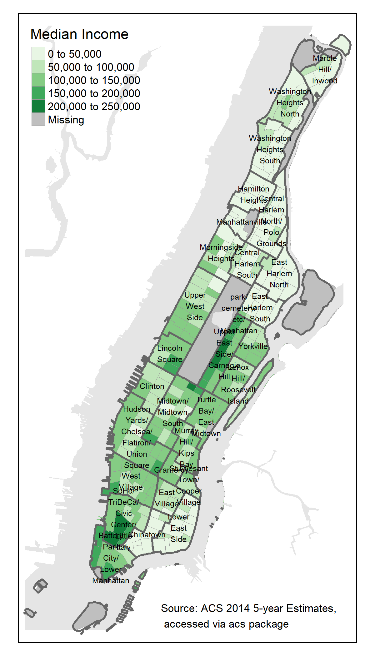
Wrap up


Chapter 4
- reading in spatial data
- transforming coordinate systems
- adding data to
Spatial___DataFrameobjects - polishing a map